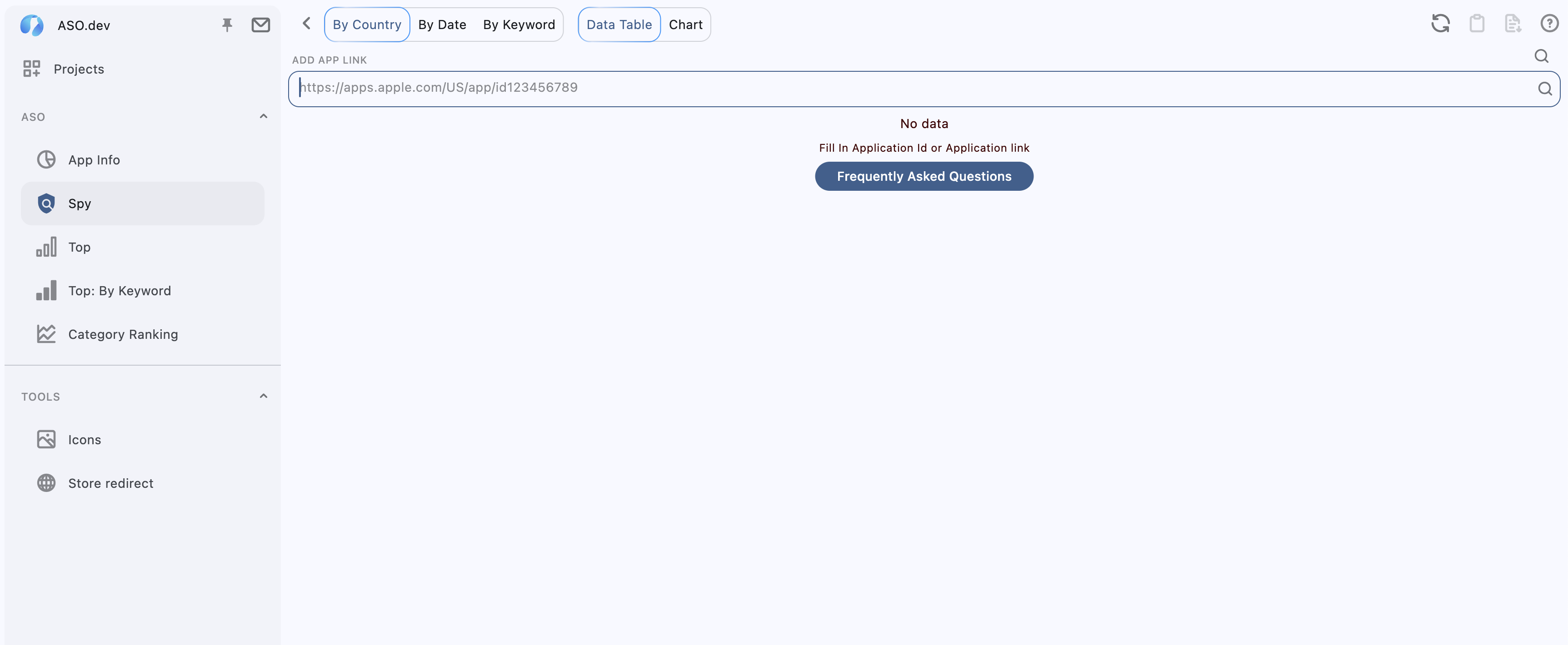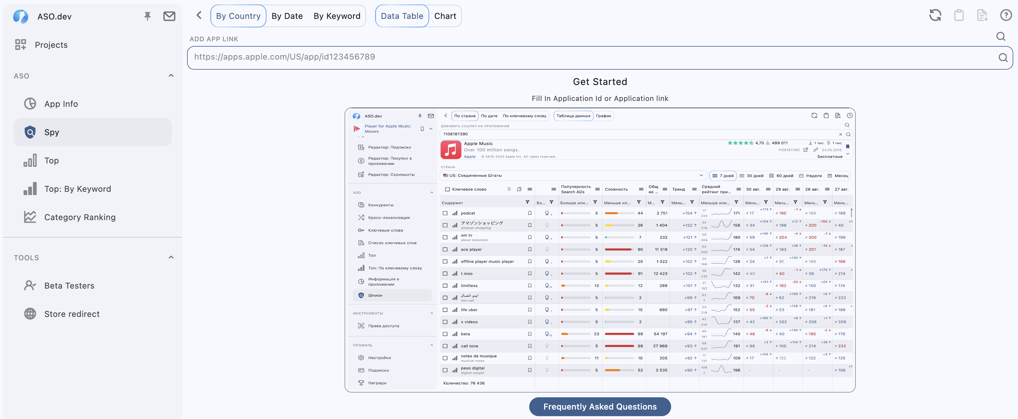

Working on #UX improvements
Instead of just a blank space, add helpful screenshots that show how the feature works. This makes it easier for users to understand what's next and how to interact with the app.
What do you think about it?
before and after: